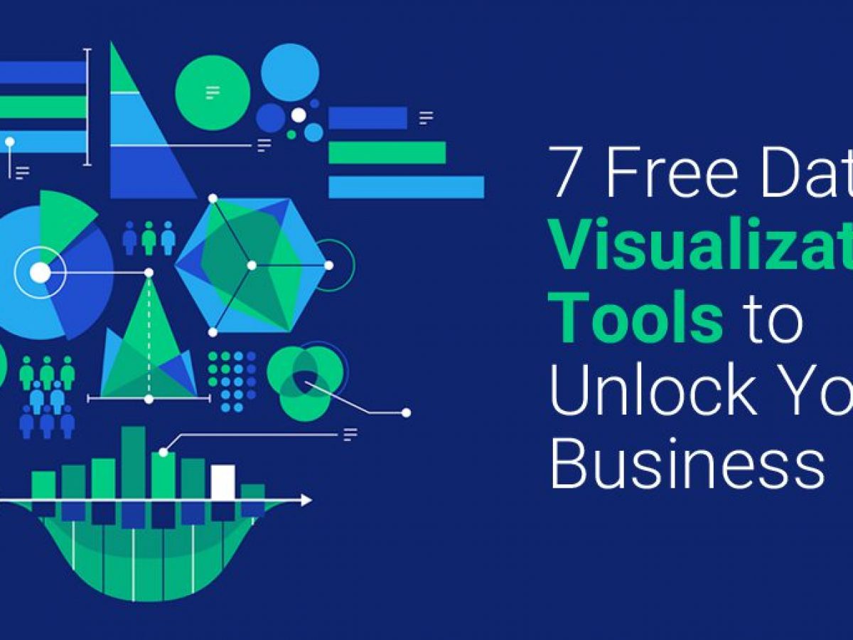
Top 5 Features of Data Visualization Software That Can Transform Your Data
Data visualization software has become an essential tool for businesses looking to harness the power of their data. The top five features that can truly transform your data include:
- Interactive Dashboards: These allow users to explore data dynamically rather than digest static charts, making it easier to identify trends and insights. For example, Tableau offers interactive dashboards that enhance user engagement and understanding.
- Customizable Templates: Many tools provide customizable templates to streamline the visualization process. Programs like Microsoft Power BI allow users to tailor designs that align with their branding and preferences.
Moreover, additional features such as data integration capabilities, which enable seamless connections with various data sources, greatly enhance usability. For instance, D3.js facilitates powerful integration with web data, allowing for sophisticated visualizations. Another key feature is collaboration tools, which support team efforts by allowing multiple users to work on the same project. Tools such as Qlik Sense provide features that help teams make informed decisions collectively.
How Data Visualization Software Makes Complex Data Easy to Understand
The advent of data visualization software has revolutionized the way we interpret complex datasets. These tools transform raw data into intuitive visual formats, such as graphs, charts, and dashboards, allowing users to quickly grasp significant trends and patterns. For instance, software like Tableau and Microsoft Power BI empower businesses to present data in a way that not only simplifies analytical processes but also enhances decision-making. By converting convoluted numbers into visual stories, users can engage with their data more effectively, leading to better outcomes.
Moreover, data visualization aids in reducing the cognitive load on users by offering a clear and organized representation of information. This becomes especially critical in industries such as healthcare and finance, where data complexity can be overwhelming. With tools that provide customizable visuals, like D3.js, stakeholders can tailor reports to highlight key metrics that matter most. As a result, data visualization not only enhances comprehension but also promotes data-driven strategies, making it an essential component in today's fast-paced business environment.
What to Look for When Choosing Data Visualization Tools for Your Business
When selecting data visualization tools for your business, it's imperative to consider the specific needs of your organization. First and foremost, evaluate the user-friendliness of the tool. A tool that is intuitive and easy to use will empower your team members, regardless of their technical skills, to create compelling visualizations without extensive training. Look for features such as drag-and-drop functionality and customizable dashboards. Additionally, assess the integration capabilities with your existing systems, such as CRM software and databases. Tools like Tableau and Power BI are notable for their strong integration capabilities.
Another critical factor is the type of visualizations offered by the tool. Different tools provide varying types of charts, such as bar graphs, line graphs, and heat maps, catering to diverse analytical needs. Make sure to choose a tool that offers advanced features like interactive dashboards and the ability to handle large datasets effectively. Moreover, consider the cost of the software, as it should fit within your budget while providing the features your business requires. For insights on pricing models, explore resources like G2 for comprehensive comparisons.